Ever wonder how much value is Salesforce bringing to your organization? Value Analytics App is here for you!
The purpose of this blog is to go through a quick overview of Value Analytics templated app as compliment to your existing Event Monitoring App and how it can bring value to your organization. A lot of CRMA users leverage Event Monitoring App for the purpose of tracking usage of their main Salesforce org, and basically determine if their users are taking advantage of their Salesforce investment! Event Monitoring creates datasets for us based on Event Logs. These datasets are built off the selections you make in the configuration wizard when you go to create the app. Additionally, it will create 16 out of the box prebuilt dashboards for you to provide immediate value. Event Types within these dashboards include Logins, Logouts, URI, lightning, VisualForce, Page Loads, API Calls, Apex Executions, and Report Exports. Now, Value Analytics and Event Monitoring Plus leverage the same event types (plus additional ones which can be found in this link: Event Log File Types)
Why Value Analytics?
Now, although the Event Monitoring app is great as a starter app to understand event types, in my opinion if you are dealing with more advanced CRMA users Value Analytics and EM plus might be a better alternative (or a perfect addition to Event Monitoring)
The datasets in Event Monitoring still leverage dataflow for construction which is fairly complicated to customize/ perform additional calculations; the recipes in Value Analytics are extremely easy to modify/clone/add additional calculations
The visualizations in EM answer good questions such as “Who Logs In the Most?”, ”Which User-Agents Are Logged In From?”, ”Which IP Addresses Are Users Logging In From?“ however what if you want to get into detail such as what does the User Journey look like? ”Where are users stalling“ Identify technical debt and where users are seeing value in Salesforce?”, ‘how is the Salesforce adoption trending“ and what can we do to improve a user’s journey when they log into Salesforce? then Value Analytics or Event Monitoring Plus will be better solutions
Finally, even though the visualizations of EM are easy to understand and to the point, Value Analytics and EM plus visualizations are extremely appealing and from a user experience perspective they follow a flow to easily guide whoever is leveraging these
For these reasons, the Value Analytics and Event Monitoring plus app were created by an absolute genius who thought of all these possible questions. So let’s analyze my favorite use case from Value Analytics! which is understand a user’s journey, and identify good and bad behaviors relevant to the business and how these behaviors lie behind business defined outcomes.
In order to explore these; you can download Value Analytics which can be found in App Exchange. Note: You will need a CRM Analytics Admin Permission set and access to the Event Monitoring Datasets in Analytics studio. now this App has multiple dashboards for various use cases but as I said, I’ll focus on my favorite which is tracking user activities and journeys. The reason this dashboard is so valuable, is it really lets a company understand which pieces of their Salesforce org are valuable to business users as well as understand how to improve them.
Understanding Users journeys with the User Activity and Journey dashboard
User Activity and Journey
This is an adoption visualization based off the User Page Views and User Integractions in the Lightning Environment; we are looking at what everybody is doing in the whole org! You get all kinds of insights from event logs that have been transformed within CRM Analytics.
Remember that this is just showing the art of the possible and these visualizations can be customized to specific needs and use cases.
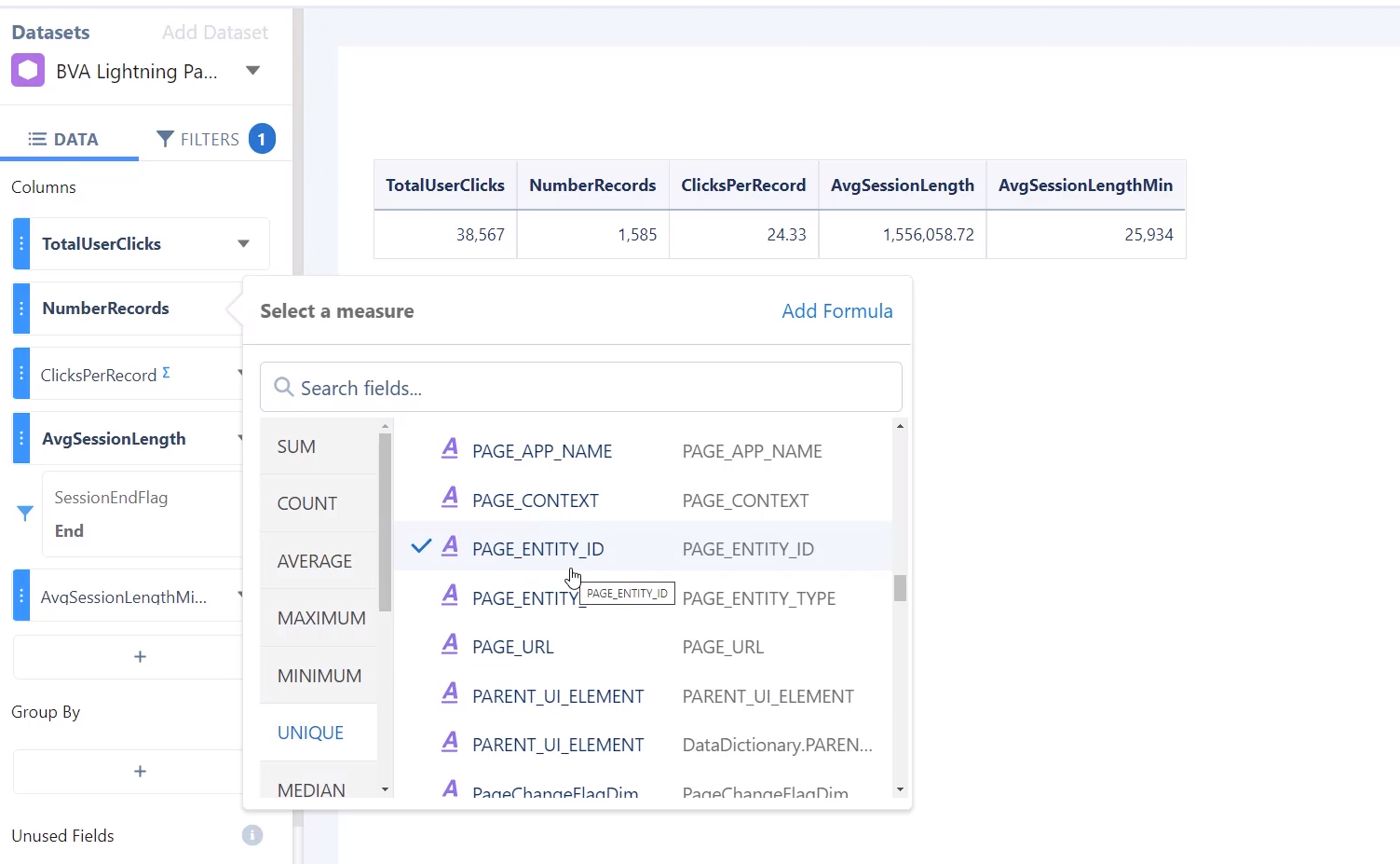
Starting from the top KPIs: we can see how many users have logged in, how often?, what are the number of pages they've viewed when they've logged in? The trending metrics Daily delta and Monthly Delta tell us if we are going up or down, the purple line is the average. In this context, Pages refer to anything such as Chatter pages, Pardot page, personal information, etc..

Now remember, behind every KPI displayed in a CRMA Dashboard, a user can click on the right arrow and explore this KPI in a new lens to understand how each of these are being calculated. For example, let’s say we want to understand how Clicks per record from the screenshot above is calculated. We click on the right arrow, explore in a new lens and we will see the information below: from my lens I can see Clicks per record is how often are people clicking on average on an individual record.
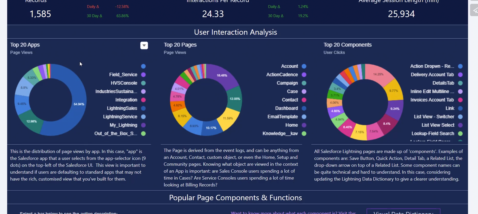
if you keep scrolling down in your dashboard you will now see > Top 20 Apps > and if you think of the Salesforce hierarchy you have Apps > objects within the apps (Pages) > and then you have components within those objects for the page layouts (these can be tabs, list views, actions, etc... )
So starting from the visualization at the left, a user can easily view the percentage of page views within each app— so if you hover over an App you can see the % usage, then drilling down, you can see the number of objects we're looking at-> leads, home page, campaigns and if you drill down even further we have the distribution of components…
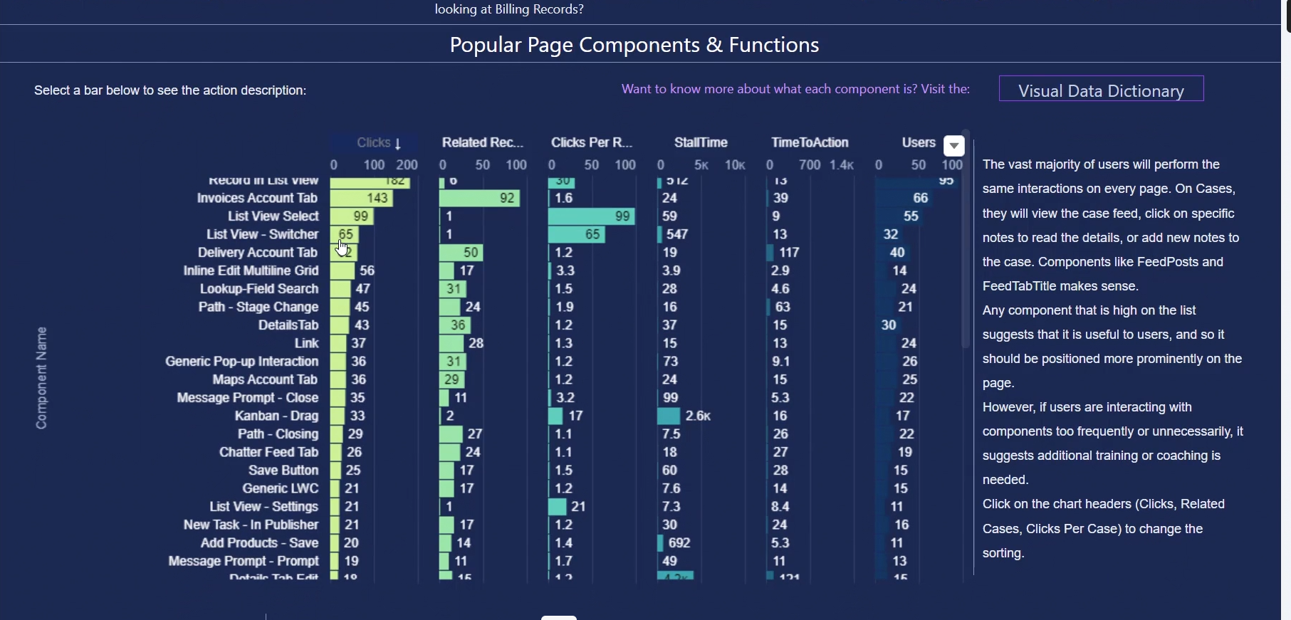
Now, let’s say you are trying to identify how successful are these components at your organization. The chart under it is essentially the third donut chart in a different format..So if you were to take an example from this list: e.g., PATH-STAGE CHANGE has had 45 clicks on 24 related records
Stall Time: take the logs and partition by the user, for a specific user you sequence the steps, and measure the the time between the steps, time between they clicked on a component-how long did they have to wait before they performed on another click.. so for example.. a user waited 16 seconds for the tab to open...
Time To Action: how long did they take before they clicked on a “component”- once the page is open the user waited 60 seconds to click on another component..
Why is this chart so relevant? it will help Salesforce admins/business analysts identify where users are getting value... are users clicking on specific components? how long are they spending here?
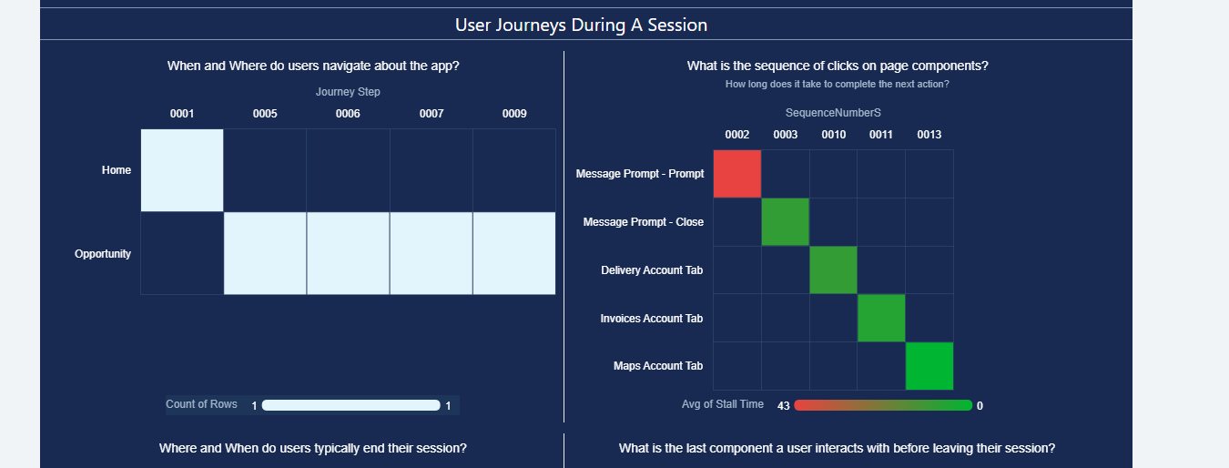
Final piece of this dashboard that’s extremely helpful is the user journey section which will tell us exactly - page by page where users went; starting on the left piece of the dashboard, this tells us the step by step users are taking first by Apps (as a reminder, the apps in this context represent the different objects) and on the right it drills down to the specific components.
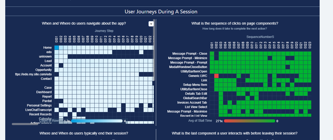
The image above shows the journey for ALL the users, however if you pick a session which is a user (in this case, the user is showing the ID instead of the name, but remember you can always augment in a recipe to bring over the user name), then we can drill down into what a specific user is doing.. so for example the user below started at home page, went to opportunity and then I can see the sequence of events both at the page level and then at the component level! this is essentially the breakdown of what all the Salesforce users are doing, down to each individual click of a component.

If you thought this dashboard was insightful for your business, feel free to check out James Kenny videos where he explains the various dashboards in Value Analytics and how you can successfully leverage these- https://vimeo.com/channels/1811385/741167403