Creative ways to Use Components and Pages
I decided to put together this blog with 3-4 ideas on how some customers leverage Components and Pages! Some of these customers thought bindings was the only solution to show some “advanced interactions”. Now, there are some scenarios where you might just need that binding, and if you are interested in bindings I HIGHLY recommend checking out Rikke’s series: All About Bindings
But in this blog, I will show you how we can use Pages and Components in creative new ways? Below are 3 use cases for pages and components..
Now let’s start with a general summary of Components and Pages:
So what exactly are components?
It’s basically a container with Pages
Think of it as a mini dashboard within a dashboard!
One of its great benefits is its Reusability: you can reuse components across dashboards
It’s a great alternative to bindings since you can create/hide/reveal interactions
You can add up to 10 dashboard components to a dashboard
20 pages per component
And what about pages?
Increase dashboard performance (fewer queries per page)
They help you guide the story
Pages apply to the layout in which they’re created
You can link pages via navigation widget
Share widgets on other pages
20 pages per dashboard
So, let’s dig into some common use cases for Components and Pages!
Display your Opportunity data in multiple currencies
This is a fun way to use components! A lot of customers leverage multiple currencies; for example Euros, Mexican pesos, USD and the ask from end users is to read Opportunity data in the correct currency. We can easily accomplish this ask by creating a component with multiple pages, one per currency and simply display the multiple currencies in a navigation widget to accomplish a “toggle”; the full steps are below:

Display Data Grouped by Year/Month/Quarter
As I showed in the previous video, a very common ask is: “Can I have a “Toggle” where I display my data by “Year”,"Quarter","Month","Day"?” and one way to accomplish this is using Static Steps to be used for a grouping, for example: Using Date Fields in Static Steps, but another option is creating a Component with different pages; so one page for "Year", one page for "Quarter", one page for "Month", and finally one page for days.
The nice thing about components is we can actually use 20 pages per component AND you can add up to 10 dashboard components to a dashboard.. Pretty cool right?
Take a look at the video below for this example:


Final Component with “Toggle” for data grouped by Month/year/previous year/last 2 years
Hide/Display a Table/Widget with pages and Links
This ask has been coming up more often recently and currently there is not an easy way on the UI to hide a table/widget.. but what you can do.... is 1. Create your page with the the table/chart you wish to display, 2. Duplicate your page, 3. Add a Link widget to your page, 4. Redirect your users to the duplicate page with the full chart for a hide/display effect.
For implementation watch the video below:

Where to get started if you’re new to components?
The Customer Insights templated app leverages components! so it’s a great app to get started with; make sure you follow the steps below to create your app and start reusing some of those components:
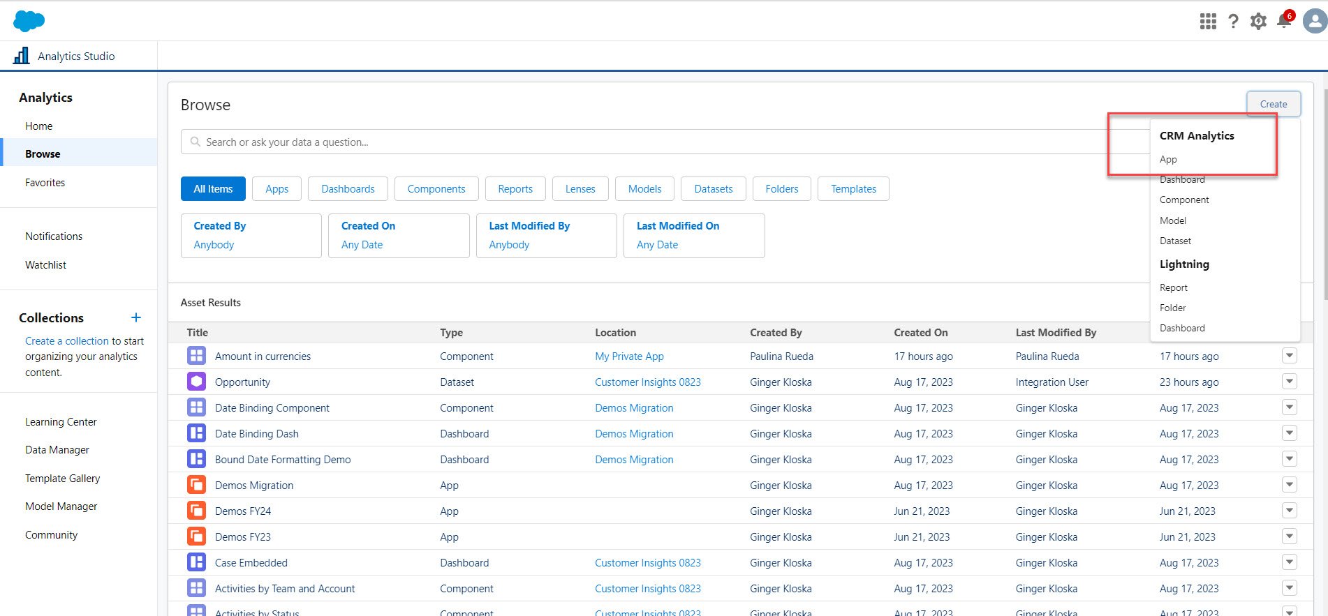
Step 1: Create App
Search for Customer Insights Analytics App

2. Select customer insights and create your App
Once created go to your app > Components > and explore the full list of components available

3. Full Gallery of components
Now, this step is the interesting part, let’s say you have a dashboard created for cases and you want to enhance this visualization by adding cases by status and priority. Since Customer Insights creates a lot of various components for you, you can simply leverage of the pre-created ones and embed it into your db!

Now, we did this exercise with Cases, but keep in mind Customer Insights has 4 galleries and each gallery has elements that contain groups of charts, tables, filters, text and more in multiple dashboards - making it easy to add a group of objects to your dashboard.
GALLERY- Opportunity Components
GALLERY-Case Components
GALLERY- Activity Components
GALLERY- Opportunity Components
Try them out and let me know how you like them!